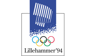
Milton Glaser, mannen bak I ❤ NY-designet, har gitt sin vurdering av alle OL-logoene, inkludert kommentar og karakter. Om Lillehammer ’94 sier han:

It’s very difficult to understand the white architectural image in the blue box unless it’s a stadium. The idea of the aurora borealis was an opportunity not to taken advantage of. Putting the words to ‘Lillehammer ’94’ under the rings helps the coherence of the mark.
Via @kottke
